11hundred

Aloria Health:

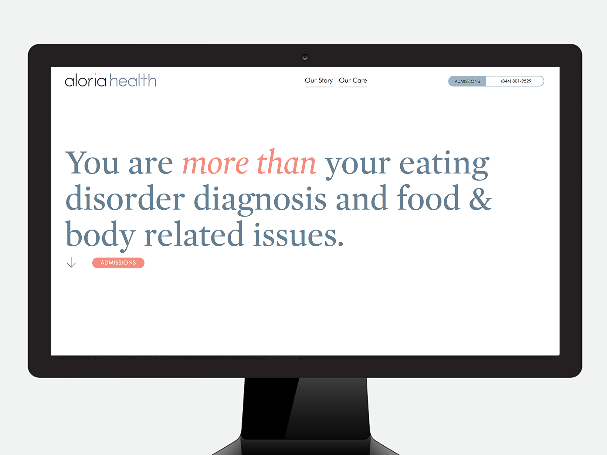
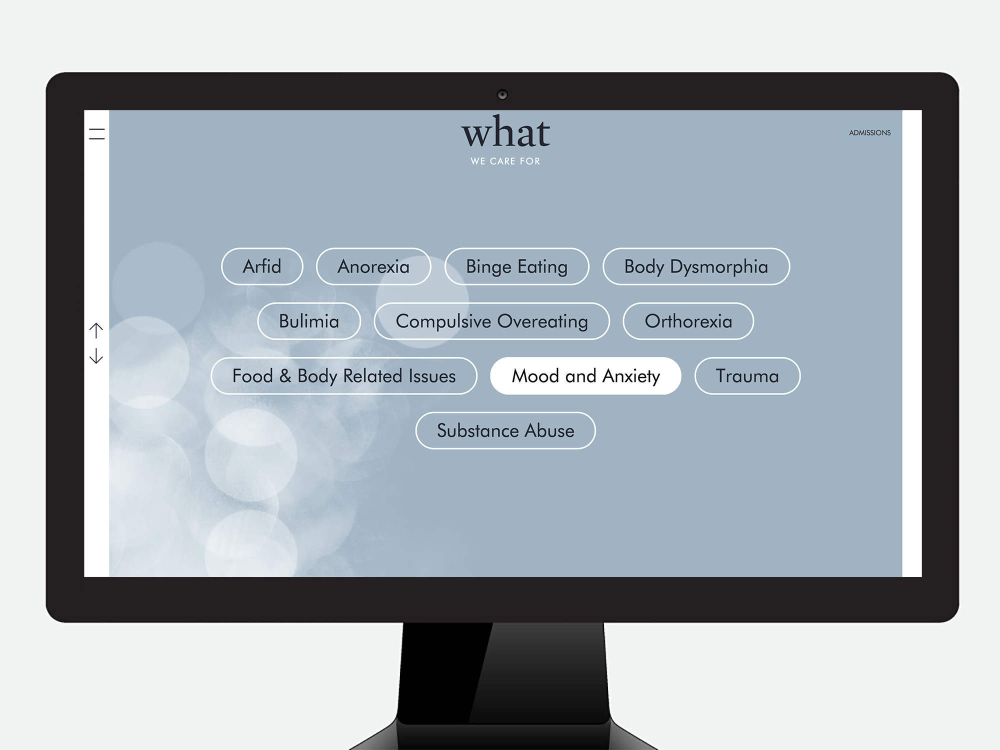
Milwaukee based Aloria Health provides medical support to people affected by eating disorder diagnoses. Working together, we created the brand identity & execution.

  • 2015-2019
  • What was done:

    Strategy
    Identity
    Brand Guidelines
    Interactive
    Photography

We all have something.

Made up of a diverse group of industry veterans, the Aloria Health leadership wanted the brand to stand out from the competitors. 


Simplicity

Based on a simple geometric typeface– Futura Light, the logotype is both approachable and memorable. While designing the mark we recognized that there was an opportunity to reinforce the idea of stability through repetition.

The cutouts in the letterforms add a natural element to the logotype, without becoming too heavy handed.


Rhythm

When looking at what makes up the letterforms of the name “Aloria” we realize there are two shapes repeated throughout- a quarter circle and line.

These can then be used as patterns, or large graphical elements in marketing communications.


Structure

Armed with a logo and brand elements, we then created a set of brand and voice guidelines to help the internal marketing team, and outside partners create memorable marketing tools that stay on brand.

“Our brand guidelines developed through 11hundred make maintaining our brand throughout all areas of media and advertising easy to do.”

THE WORK

11hundred App Design
11hundred Website Design
11hundred Chicago Graphic Design
11hundred Identity Design
//